01Why this exists
Every month the internal reporting team (usually operations or risk) publishes a 23-page Performance Report PDF: cover, summary tables, absolute & relative returns, dollar PnL, public & private valuation bridges, peer rankings, co-investments. Each section is a wall of tables. Pulling any one manager's story — "what was Manager X's FYTD vs benchmark, and how has that changed month over month?" — means cross-referencing four tables on four pages and scrolling back through a folder of last quarter's PDFs.
The investment team needs to answer that question fast, often in front of the CIO or the board. The dashboard turns 23 pages of static tables into one interactive screen where every manager is one click away.
02Data sources & pipeline
The dashboard is built by a single Python script (build_dashboard.py) that walks a folder of PDFs and produces one self-contained HTML file.
| Source | Format | What it gives us |
|---|---|---|
| Monthly Performance Report | PDF (15+ tables) | Returns, NAV, weights, valuation bridges, PnL, peer rank |
| Manager Aliases file | JSON (optional) | Collapses fund rebrands across snapshots |
| Internal CRM (live mode) | HTTP API | Meeting notes & research linked to each manager |
Per-section parsing is pdfplumber + careful column-count invariants. The Summary table has 6 columns, Absolute % Returns has 7, the public valuation bridge has 11, and the private bridge has 13. Each parser knows exactly how many trailing numerics to pop off each line and what to do with the leftover label. Benchmark rows ("Russell 3000", "MSCI ACWI") need a second reparse at 5 columns so trailing digits in the benchmark name aren't eaten as data.
Fuzzy matching links each parsed manager to the internal CRM record (~1,150 entries) with a combined SequenceMatcher + token-set + brand-prefix score. Current match rate: 235 of 245 (96%); the unmatched ones are typically tiny side-pockets and terminated funds.
03Salient features
Multi-snapshot browser
Cascading Month → Run Date dropdowns let you switch between any historical report instantly. Every section re-renders with the picked snapshot's data.
Manager detail panel
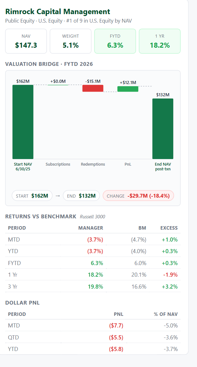
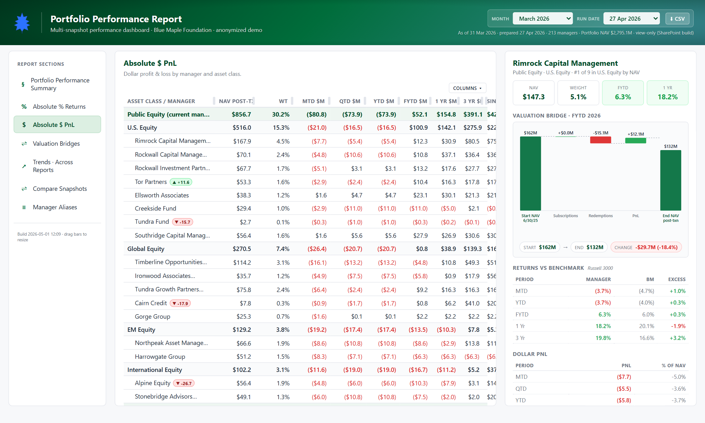
Click any manager in any section and the right pane shows: hero stats, valuation bridge (waterfall), returns vs benchmark, dollar PnL, flows & drivers, contribution to LTP, and recent CRM notes.
Peer rank by sub-class
Each manager's rank within its sub-asset-class is computed live (e.g. "#1 of 9 in U.S. Equity") and shown alongside their hero stats.
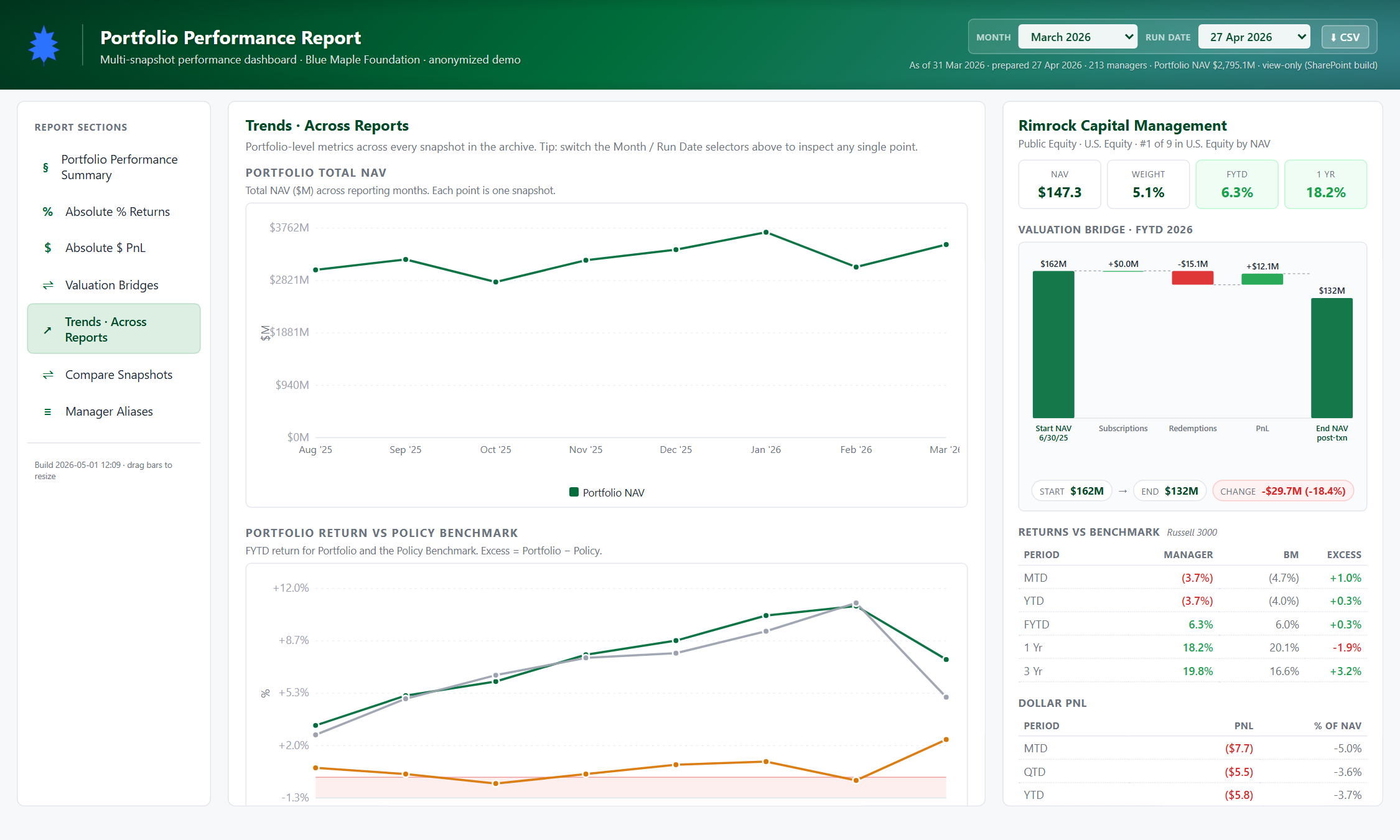
Cross-snapshot trends
Click "Trends" in the sidebar to see LTP NAV and FYTD returns charted across every historical report — one line per asset class.
CRM integration
Live mode hits the internal CRM at localhost:8080 and surfaces matched meeting notes inline. Static mode (this demo) hides the CRM widgets gracefully.
Aliases for rebrands
Optional manager_aliases.json collapses fund renames across snapshots so trend lines don't break when a manager rebrands mid-year.
An important design choice: the waterfall chart always renders if bridge data exists for the manager, even if you clicked them from the Returns or PnL tables. One consistent panel shape across sections.
04How to use it
The walkthrough below assumes the demo is open at performance.html.
Land on the Summary section
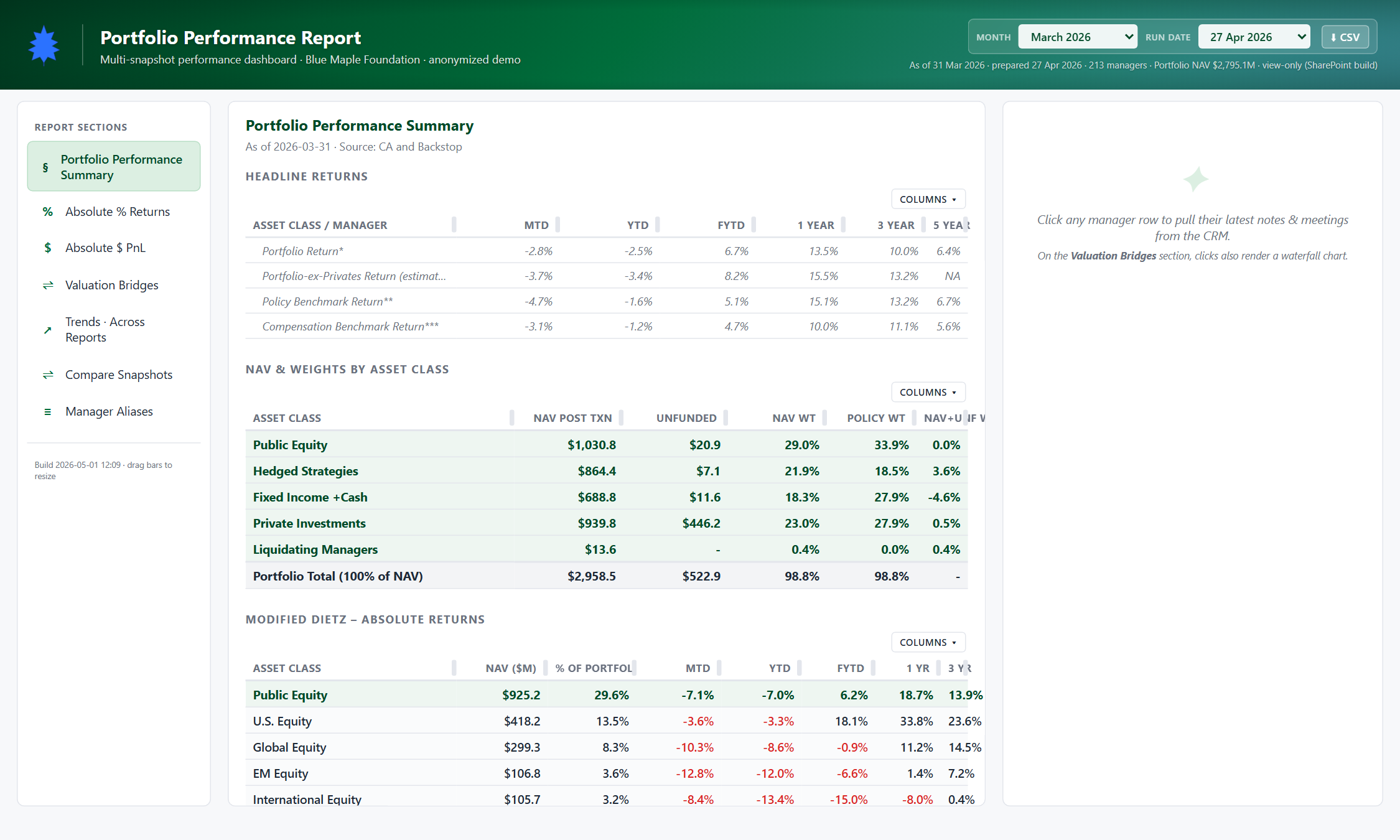
The default view is the Performance Summary — four tables stacked top-to-bottom: Headline Returns, NAV & Weights by Asset Class, Modified Dietz Absolute Returns, and Modified Dietz Relative Returns. Each row is one asset class or sub-asset-class.
Switch between historical snapshots
Use the Month and Run Date dropdowns in the top-right of the hero. Picking a different month re-renders every section with that snapshot's data — tables, manager detail panel, trends, the lot.

Navigate sections from the left sidebar
Six sections live in the sidebar: Performance Summary, Absolute % Returns, Absolute $ PnL, Valuation Bridges, Trends, Compare Snapshots, Manager Aliases. The active section is highlighted; click another to swap the main panel.
Open the Absolute % Returns view
The most-used section. Each manager row shows NAV, Unfunded, MTD, YTD, FYTD, 1Y, and 3Y returns alongside their benchmark. Color-tinted by sub-asset-class headers so the hierarchy is visually obvious.
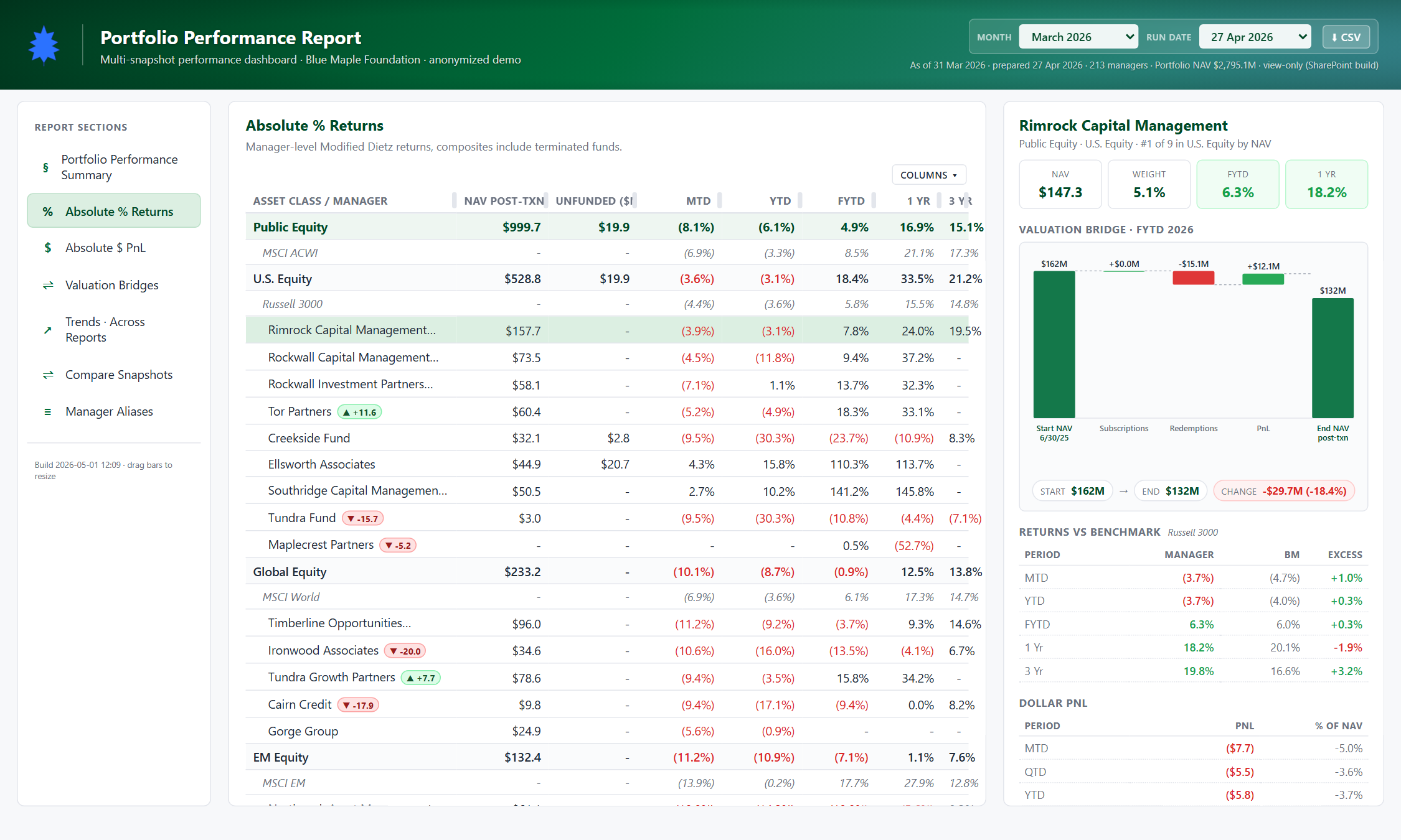
Drill into a manager
Click any manager row in any table. The right-hand detail pane fills with their full profile: name & asset class crumb, four hero stats (NAV, Weight, FYTD %, 1Y %), valuation bridge waterfall, returns-vs-benchmark line chart, dollar PnL by period, flow drivers, and contribution to total LTP in basis points.

Read the valuation bridge
Every waterfall has the same five-step shape: Start NAV → inflows → outflows → PnL / MV Change → End NAV. The labels swap by fund type — public funds show Subscriptions → Redemptions → PnL, private funds show Calls → Distributions → MV Change. Private funds also display vintage, TVPI, and IRR summary cards above the waterfall.
Jump to PnL or Bridges
The Absolute $ PnL section shows dollar contribution to LTP (NAV-weighted) so you can quickly see who moved the needle this month. The Valuation Bridges section gives you the full bridge tables for every fund on one screen.
Look at cross-snapshot trends
The Trends section breaks out of the single-snapshot view. Pick LTP NAV or FYTD return and you get a line chart per asset class across every snapshot ingested. Hover any point to see the exact value and snapshot date.
Resize the panes
Drag the green vertical bars between the sidebar, main panel, and detail panel to give yourself more room. Double-click a bar to reset that pane to its default width. Widths persist in localStorage per browser.
Export the current view
The CSV button next to the snapshot picker downloads whatever's currently on screen as a CSV. Useful for pasting into emails or board materials without re-extracting from the PDF.